Today I describe how to color the terminal ends of a dendrogram based on some metadata variable you want to define. If you would just like to see the code, click here.
Most of the projects I work on involve some sort of clustering analysis. For one of them, I wanted to color the ends of a dendrogram by some variable from my metadata, to visualize whether that variable followed the clustering. There exist excellent packages in R like ggdendro that allow you to either plot colored bars under dendrograms to represent how groups cluster or color the terminal segments by the cluster itself.
That said, I still haven’t found an easy way to change the color of the terminal ends of the dendrogram itself based on user-defined metadata, which I personally think can be more visually appealing in some situations. This tutorial describes how I figured out how to do it and provides reproducible code if you are hoping to do the same thing!
Dendrogram Basics
Before I start, what is a dendrogram, anyway?
A dendrogram is a graphical representation of hierarchical
clustering.
Clusters can be made in different ways (i.e., top-down or bottom-up),
most commonly in R through the application of hclust() on a distance
matrix. Dendrograms are built by connecting nodes to branches or other
nodes, resulting in a tree-like figure that shows how individual things
are related to each other based on multiple variables.
Let’s say we want to compare how invidual irises relate to each other in
the well-known R-core data
set.
This dataframe contains four numeric vectors
(Sepal.Length, Sepal.Width, Petal.Length, and Petal.Width) as well
as one character vector (Species). We could easily construct and plot
a dendrogram incorporating all these numeric data with base R, but what
if we want to color the terminal segments by the species of iris to
visualize whether Species follows the clustering determined by
hclust()?
Step 1: Install Packages
For this tutorial, you’ll want to load three R packages: tidyverse for
data manipulation and visualization, ggdendro to extract dendrogram
segment data into a dataframe, and RColorBrewer to make an automatic
custom color palette for your dendrogram ends. If you would like to make
your dendrogram interactive, be sure to load plotly as well.
pacman::p_load(tidyverse, ggdendro, RColorBrewer, plotly)
Step 2: Load Data
Now we’ll want to load the iris dataframe into our environment.
Typically, we have sample names mapped to each observation, so we will
want to create our own (sample_name) right at the start.
With microbial community data, I usually work with two objects: a giant
matrix of ASV abundances by sample_name, and metadata associated with
each sample. To simulate this, we will separate iris into
numeric_data, from which we will calculate distance and construct a
dendrogram, and metadata, which consists simply of the species of iris
for each sample. For this workflow, it is important to have a
sample_name identifier for each observation; it will be the basis of
merging everything at the end.
# label rows with unique sample_name
dat <- iris %>%
  mutate(sample_name = paste("iris", seq(1:nrow(iris)), sep = "_")) # create unique sample ID

# save non-numeric metadata in separate dataframe
metadata <- dat %>%
  select(sample_name, Species)

# extract numeric vectors for distance matrix
numeric_data <- dat %>%
  select(Sepal.Length, Sepal.Width, Petal.Length, Petal.Width, sample_name)

# check data
head(numeric_data)
##   Sepal.Length Sepal.Width Petal.Length Petal.Width sample_name
## 1          5.1         3.5          1.4         0.2      iris_1
## 2          4.9         3.0          1.4         0.2      iris_2
## 3          4.7         3.2          1.3         0.2      iris_3
## 4          4.6         3.1          1.5         0.2      iris_4
## 5          5.0         3.6          1.4         0.2      iris_5
## 6          5.4         3.9          1.7         0.4      iris_6
Step 3: Normalize Data and Create Dendrogram
Before we make the dendrogram, we will calculate a distance matrix based
on numeric_data using dist(). It is good practice to normalize your
data before doing this calculation; I will therefore normalize all
values within a vector on a scale from 0 to 1.
After we do that, we can create a distance matrix (dist_matrix) and
generate a dendrogram from our normalized data.
# normalize data to values from 0 to 1
numeric_data_norm <- numeric_data %>%
  select(sample_name, everything()) %>%
  pivot_longer(cols = 2:ncol(.), values_to = "value", names_to = "type") %>%
  group_by(type) %>%
  mutate(value_norm = (value-min(value))/(max(value)-min(value))) %>% # normalize data to values 0-1
  select(sample_name, value_norm) %>%
  pivot_wider(names_from = "type", values_from = "value_norm") %>%
  column_to_rownames("sample_name")

# create dendrogram from distance matrix of normalized data
dist_matrix <- dist(numeric_data_norm, method = "euclidean")
dendrogram <- as.dendrogram(hclust(dist_matrix, method = "complete"))
Step 4: Extract Dendrogram Segment Data Using ggdendro
Now let’s quickly take a look at what our dendrogram looks like using base R:
plot(dendrogram)

Okay, it’s not very pretty, but bear with me. This is a useful visual to
show how we will extract the coordinate data from the dendrogram object
with ggdendro::dendro_data() to make a better figure. Every dendrogram
is plotted by adding individual segments between points on an x and y
grid.
When we apply ggdendro::dendro_data() and look at the extracted
segment data, we see there are four vectors for every dendrogram: x,
y, xend, and yend. Every horizontal or vertical line you see in
the base R figure is ultimately constructed from one row of the
following dataframe:
# extract dendrogram segment data
dendrogram_data <- dendro_data(dendrogram)
dendrogram_segments <- dendrogram_data$segments # contains all dendrogram segment data

head(dendrogram_segments)
##           x         y      xend      yend
## 1 54.982910 1.6511874 18.886719 1.6511874
## 2 18.886719 1.6511874 18.886719 0.6103705
## 3 18.886719 0.6103705 10.773438 0.6103705
## 4 10.773438 0.6103705 10.773438 0.4096452
## 5 10.773438 0.4096452  4.296875 0.4096452
## 6  4.296875 0.4096452  4.296875 0.2548251
We will split these coordinate data into two dataframes:
dendrogram_segments, containing all the segments, and
dendrogram_ends, containing only the terminal branches of the figure.
As the plot above shows, when the value in the y-direction as 0 (i.e.,
yend == 0), that only includes those single segments at the bottom of
the plot:
# get terminal dendrogram segments
dendrogram_ends <- dendrogram_segments %>%
  filter(yend == 0) %>% # filter for terminal dendrogram ends
  left_join(dendrogram_data$labels, by = "x") %>% # .$labels contains the row names from dist_matrix (i.e., sample_name)
  rename(sample_name = label) %>%
  left_join(metadata, by = "sample_name") # dataframe now contains only terminal dendrogram segments and merged metadata associated with each iris
Looking at dendrogram_ends, we now have a dataframe with vectors
containing the dendrogram coordinate data matched to the sample_name
and Species vector. We are now ready to start plotting in ggplot2!
head(dendrogram_ends)
##   x        y.x xend yend y.y sample_name   Species
## 1 1 0.15339027    1    0   0    iris_101 virginica
## 2 2 0.10971611    2    0   0    iris_116 virginica
## 3 3 0.06047157    3    0   0    iris_137 virginica
## 4 4 0.06047157    4    0   0    iris_149 virginica
## 5 5 0.07148290    5    0   0    iris_142 virginica
## 6 6 0.07148290    6    0   0    iris_146 virginica
Step 5: Generate a Custom Color Palette for Dendrogram Ends Based on Metadata Variables using RColorBrewer (Optional)
If you want to dynamically create a list of colors based on how many
unique variables the metadata vector of interest contains, you can run
this code. In this example, our metadata only contains three species
of iris, so this could be done manually fairly quickly. However, if the
number of unique species in your dataset is more than that, as is common
with microbial community data, chances are you might want to automate
this process.
# Generate custom color palette for dendrogram ends based on metadata attribute
unique_vars <- levels(factor(dendrogram_ends$Species)) %>%
  as.data.frame() %>% rownames_to_column("row_id")

# count number of unique variables
color_count <- length(unique(unique_vars$.))
# RColorBrewer
get_palette <- colorRampPalette(brewer.pal(n = 8, name = "Set1"))

# produce RColorBrewer palette based on number of unique variables in metadata
palette <- get_palette(color_count) %>%
  as.data.frame() %>%
  rename("color" = ".") %>%
  rownames_to_column(var = "row_id")
color_list <- left_join(unique_vars, palette, by = "row_id") %>%
  select(-row_id)
species_color <- as.character(color_list$color)
names(species_color) <- color_list$.
If you don’t want to bother with the above code for this tutorial, you could manually create a named character vector as an alternative:
# Alternatively, create a custom named vector for iris species color:
species_color <- c("setosa" = "#E41A1C", "versicolor" = "#CB6651", "virginica" =  "#F781BF")
Step 6: Plot your Custom-Colored Dendrogram!
Now it’s time to plot our dendrogram! You will want to define two geoms
for geom_segment: one plotting all the segment data extracted from Step
4, which are uncolored, and one for just the terminal branches of the
dendrogram, which is what we will color with name_color from the
previous step. If you wrap this plot this with plotly (see below), I
recommend adding an extra text aesthetic to control which information
will display on your output.
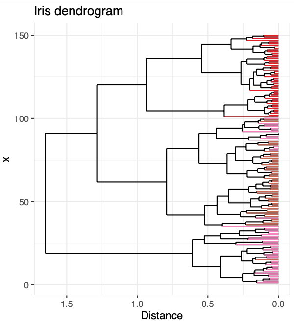
p <- ggplot() +
  geom_segment(data = dendrogram_segments,
               aes(x=x, y=y, xend=xend, yend=yend)) +
  geom_segment(data = dendrogram_ends,
               aes(x=x, y=y.x, xend=xend, yend=yend, color = Species, text = paste('sample name: ', sample_name,
                                                                                   '<br>',
                                                                                   'species: ', Species))) + # test aes is for plotly
  scale_color_manual(values = species_color) +
  scale_y_reverse() +
  coord_flip() + theme_bw() + theme(legend.position = "none") + ylab("Distance") + # flipped x and y coordinates for aesthetic reasons
  ggtitle("Iris dendrogram")

p
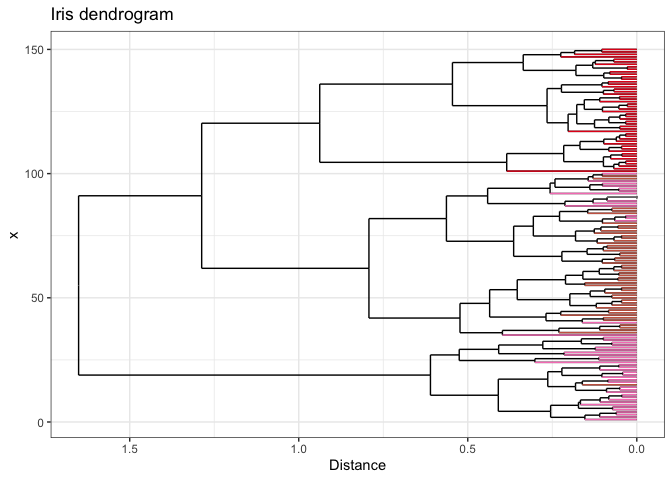
If you want to get really fancy, you can wrap your ggplot with
plotly to make your dendrogram interactive! Be
sure to specify tooltip = "text" to control which information is
displayed.
p.lotly <- ggplotly(p, tooltip = "text")
Open me in a new tab to view the interactive plot!
And there you have it - dendrogram ends dynamically colored by your metadata! I hope you found this helpful. If you have any questions, comments, or suggestions, please feel free to comment below or contact me directly! :]