I have always been a HUGE map nerd. One of the best, geekiest Christmas gifts I was given as a kid was the latest Collegiate Atlas of the World from National Geographic, which I still have sitting on my bookshelf and occasionally flip through. Without access to digital tools like Google Earth, reading that Atlas gave me the freedom to travel the world without having to deal with the pesky truth of being 10 and not having any money or know-how to do so. I deeply appreciate all the artistry, knowledge, and skill that goes into making a good map.
I am also a HUGE cave nerd. My graduate research focuses on studying the microbes that call subsurface environments like caves home. I have worked in caves formed by cooled lava and have recently begun examining microbes that live in karst caves.
So, imagine my excitement when I discovered that the World-wide Hydrogeological Mapping and Assessment Programme, or WHYMAP, provides the underlying data for their beautiful maps of major karst groundwater systems around the world. I wanted to get a better grasp of the global distribution of karst caves and springs to help inform my literature search of which microbes colonize those sorts of subsurface environments.
I took the data from WHYMAP’s World Karst Aquifer Map project to create an interactive map of global karst. As someone interested in cave geomicrobiology, I wanted to distinguish between caves and springs, and understand the distribution of caves relative to the surface expression of karst. In this post, I will walk through how I created this visualization in R with just a few lines of code. To recreate it yourself, feel free to click here for the R code I wrote!
Step 1: Load Required Packages
To make this map, I used the packages rgdal and leaflet for loading
the geospatial data from the provided shapefile into my work environment
and plotting it. I also used tidyverse for some good ol’ data
manipulation, randomcoloR for creating color palettes, and htmltools
for helping with some of the syntax in plotting with leaflet.
pacman::p_load(tidyverse, randomcoloR, rgdal, leaflet, htmltools)
Step 2: Download and Import Karst Map Data
The World Karst Aquifer Map provides a zipped ESRI-formatted shapefile that I used for this visualization. Once you download and extract the .zip file in your project folder, a subfolder entitled “/shp” will contain the geospatial data that we will import into our working environment.
We will run the ogrListLayers() command from the rgdal package to
list all the mapping layers in the “/shp” subfolder we might be
interested in:
ogrListLayers("WHYMAP_WOKAM/shp")
## Warning: OGR support is provided by the sf and terra packages among others

## [1] "whymap_cave__v3_point"            "whymap_nonExposedKarst__v1_point"
## [3] "whymap_spring__v3_point"          "whymap_karst__v1_poly"
## attr(,"driver")
## [1] "ESRI Shapefile"
## attr(,"nlayers")
## [1] 4
From running that command, we see that there are four layers (three
“point” layers and one “polygon” layer) we can play with. Since I want
to map the locations of caves (cave_points), springs
(spring_points), and the surface expression of karst (karst_poly),
we will ignore whymap_nonExposedKarst__v1_point. readOGR() will
allow us to import those layers as R objects. After that, we will
convert the objects containing point data into fortified dataframes
which we can then manipulate!
# import WOKAM shape file layers
cave_points <- readOGR("WHYMAP_WOKAM/shp", layer = "whymap_cave__v3_point") %>%
  as.data.frame() %>% fortify()
spring_points <- readOGR("WHYMAP_WOKAM/shp", layer = "whymap_spring__v3_point") %>%
  as.data.frame() %>% fortify()
karst_poly <- readOGR("WHYMAP_WOKAM/shp", layer = "whymap_karst__v1_poly")
## OGR data source with driver: ESRI Shapefile
## Source: "/Users/matt/reverie/rmarkdown/WHYMAP_WOKAM/shp", layer: "whymap_cave__v3_point"
## with 92 features
## It has 5 fields

## OGR data source with driver: ESRI Shapefile
## Source: "/Users/matt/reverie/rmarkdown/WHYMAP_WOKAM/shp", layer: "whymap_spring__v3_point"
## with 201 features
## It has 5 fields

## OGR data source with driver: ESRI Shapefile
## Source: "/Users/matt/reverie/rmarkdown/WHYMAP_WOKAM/shp", layer: "whymap_karst__v1_poly"
## with 2805 features
## It has 2 fields
## Integer64 fields read as strings:  rock_type
Step 3: Manipulate and Prepare Data for Plotting
If we examine the cave_points dataframe, we see that there are columns
that describe the depth (c_depth_m) and length (c_length_k) of the
caves, and that if there is no data, the value is recorded as “-9999”.
The same is true of spring_points for the columns that describe the low-
and high-end values for each spring’s water flow (s_low_qms and
s_high_qms, respectively). We will therefore want to simply convert
that value to “NA”. Additionally, we will add a column named class to
each dataframe to distinguish between whether a point is a “cave” or a
“spring”.
cave_points <- cave_points %>%
  mutate_at(vars("c_depth_m", "c_length_k"), ~replace(., . < 0, NA)) %>%
  mutate(class = "cave")

spring_points <- spring_points %>%
  mutate_at(vars("s_low_qms", "s_high_qms"), ~replace(., . < 0, NA)) %>%
  mutate(class = "spring")
Now, let’s merge the cave_points and spring_points dataframes.
# merge shapefile point dataframes
merged_points <- full_join(cave_points, spring_points)
## Joining, by = c("name", "NR", "type", "coords.x1", "coords.x2", "class")
We will also use leaflet::colorFactor() to create a palette function
that colors the surface karst expressions based on their type
(RTypeLabel) and the points based on whether they represent a cave
or a spring:
# generate color palette for karst topography based on surface rock expression
poly_colors <- colorFactor(c(distinctColorPalette(
                              length(unique(levels(factor(karst_poly@data[["RTypeLabel"]])))))), # ugly!
                           domain = levels(karst_poly@data[["RTypeLabel"]]))

# generate color palette for "spring" and "cave" points
class_colors <- colorFactor(c("red", "#600734"),
                            domain = merged_points$class)
Step 4: Create the Interactive Map with Leaflet!
Now it’s time to plot our geospatial data with leaflet, a fun
JavaScript-based library that we can easily use in R to create our own
maps. We will first want to addProviderTiles() to control the
aesthetics of the underlying map. We will then map the surface karst
expressions with addPolygons(), and addCircleMarkers() to plot the
coordinate data from the merged_points dataframe. We can also control
what appears when we click on a polygon or a point with the popup
argument with some help from the htmltools package. For this plot, I
want the polygons to show the major type of surface karst expression for
that region (RTypeLabel) and the points to distinguish between caves
and springs, with associated legends.
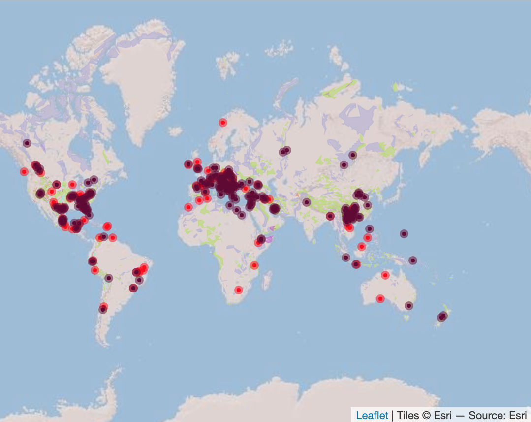
# make an interactive map of global karst environments
leaflet(merged_points) %>%
  addProviderTiles(providers$Esri.WorldShadedRelief) %>%
  addPolygons(data = karst_poly,
              color = ~poly_colors(RTypeLabel),
              weight = 1,
              fillOpacity = 0.6,
              popup = ~htmlEscape(RTypeLabel)) %>%
  addCircleMarkers(~coords.x1, ~coords.x2,
                   radius = 2,
                   color = ~class_colors(class),
                   popup = ~htmlEscape(name),
                   fillOpacity = 1) %>%
  addLegend(data = karst_poly,
            pal = poly_colors,
            values = ~RTypeLabel,
            title = "Surface karst expression") %>%
  addLegend(data = merged_points,
            pal = class_colors,
            values = ~class,
            title = "Aquifer access")
Open me in a new tab to view the interactive map!
And there we have it. I now have an interactive map to explore the global distribution of karst caves and springs that I can refer to for my research! Aren’t maps fun?